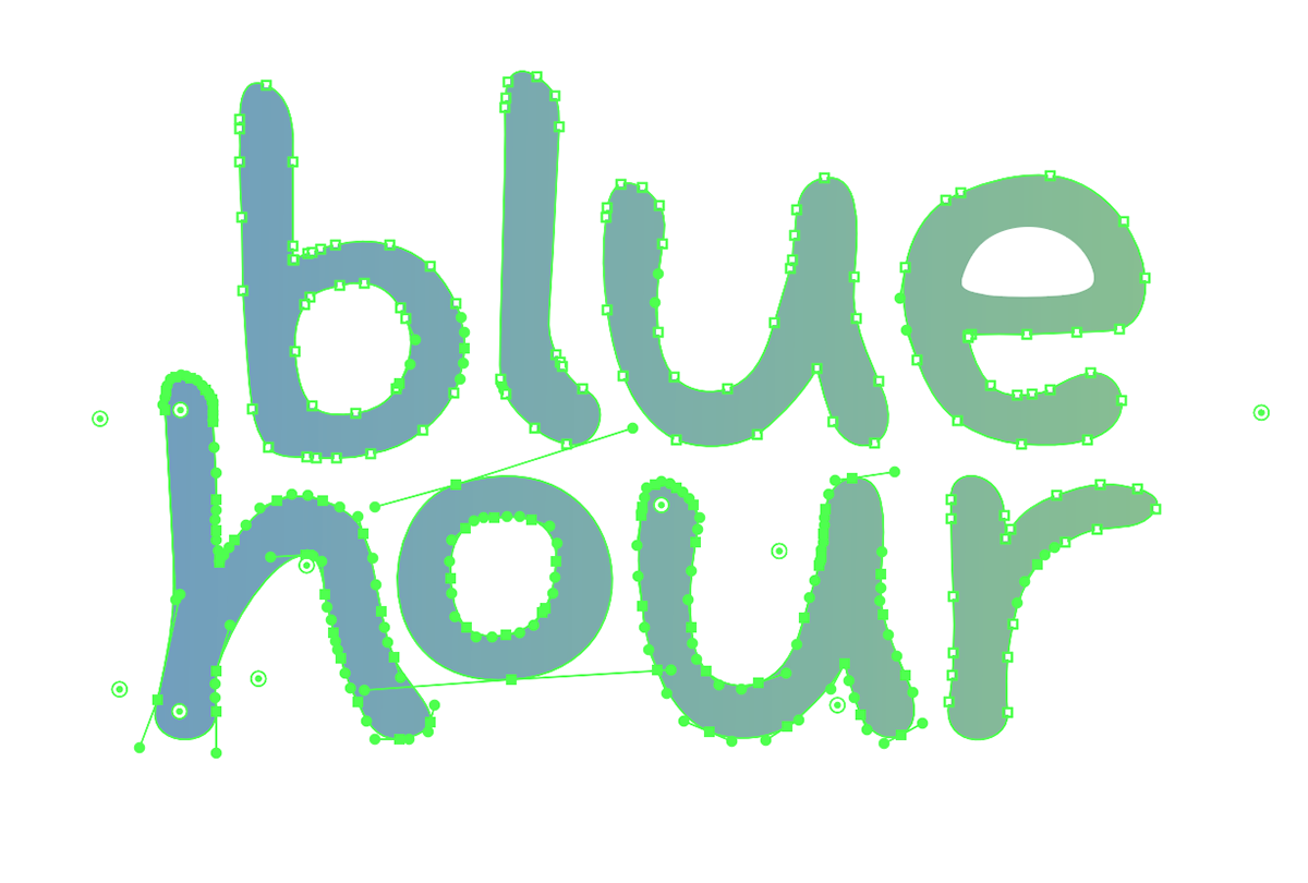
For this piece, I was aiming to create a brand guide reflective of the self-rendered typeface. This project allowed me to focus on visual hierarchy and the way type plays a major part in that. I came up with the idea of 'blue hour' as a we were presented with both a branding archetype and brand of choice.
For this branding, my selected archetype was that of ‘The Innocent’ which reflects pure and organic ideas and products. Some brands that may come to mind my be 'Dove' for cosmetics or 'Innocent' the simple ingredient juice brand. I chose a clothing brand for the platform I wanted to execute this idea.
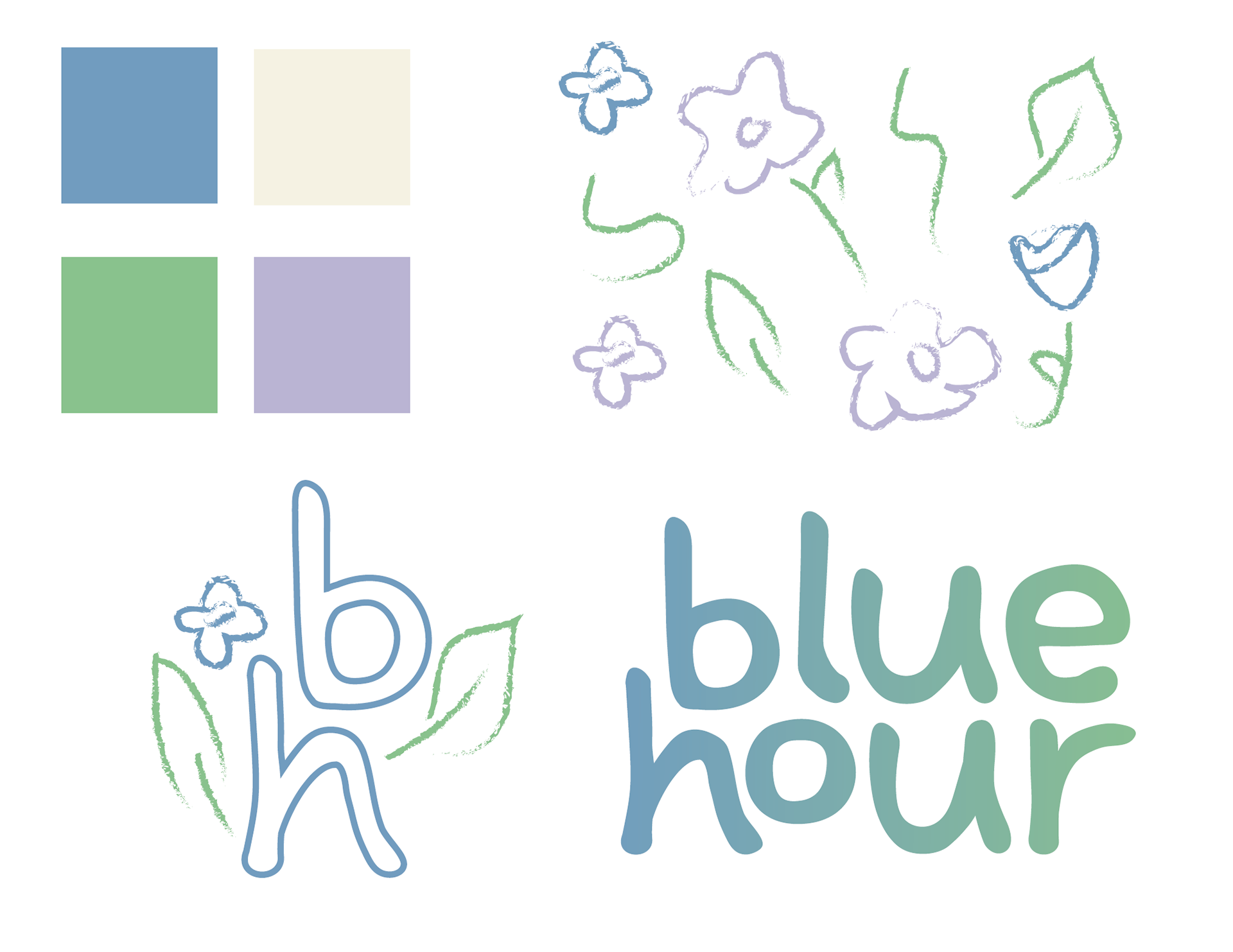
I wanted this project to serve as a sustainable and ethical fashion brand using neutrals and pastels as well as organic shapes within my self rendered typeface.


This branding project was something I found myself truly enjoying! I leave getting to work on typefaces and merge several awesome ones into something specific for what I need.
Provided above showcases the details that went into my branding overall including the flower pattern incorporated in to the framing of my brand identity. I also created a secondary logo utilizing an outlined stroke. I also chose to include gradients into the main logo as I think it really gives the font a warm and welcoming feeling to it.
