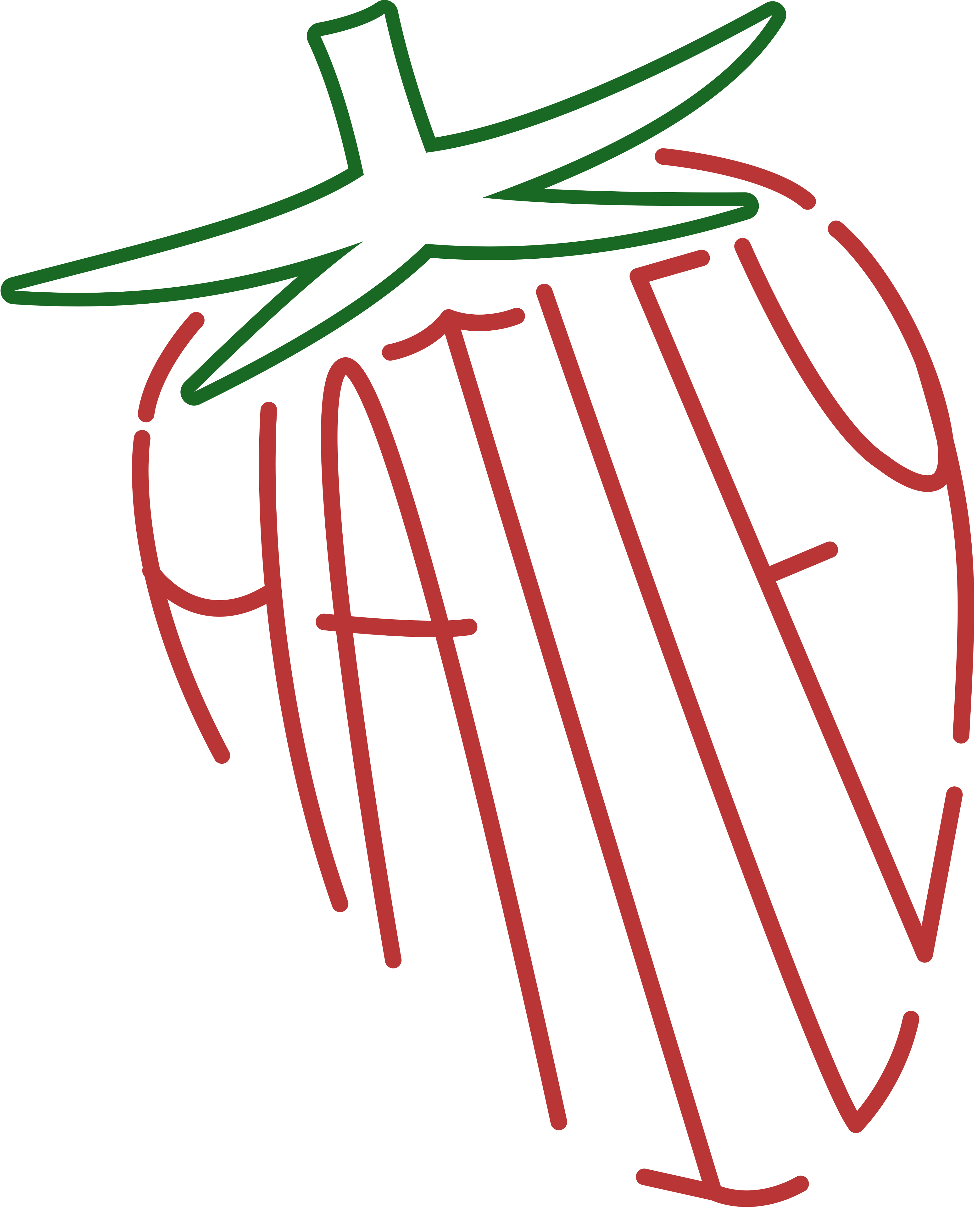
For this project, I had to go about creating a poster including a phrase in which type anatomy terms could be displayed upon and described correctly.
I selected the phrase below and the theming came naturally as this took place around February. I enjoyed the creating and execution of the different shapes, gradients, and shades of pinks. I believe I selected a very fitting typeface with the extra swashes and such to fully showcase the different anatomy of type.
I utilized a gradient to mark each section of the letter and a dashed line as the line to draw your eyes to the name of each part showcased. I did use the same typeface overall and looking back would choose a sans-serif font to create that visual hierarchy and weight difference. For the choice of sub-header text, changing the color for contrast would have increased the legibility of text overall.
