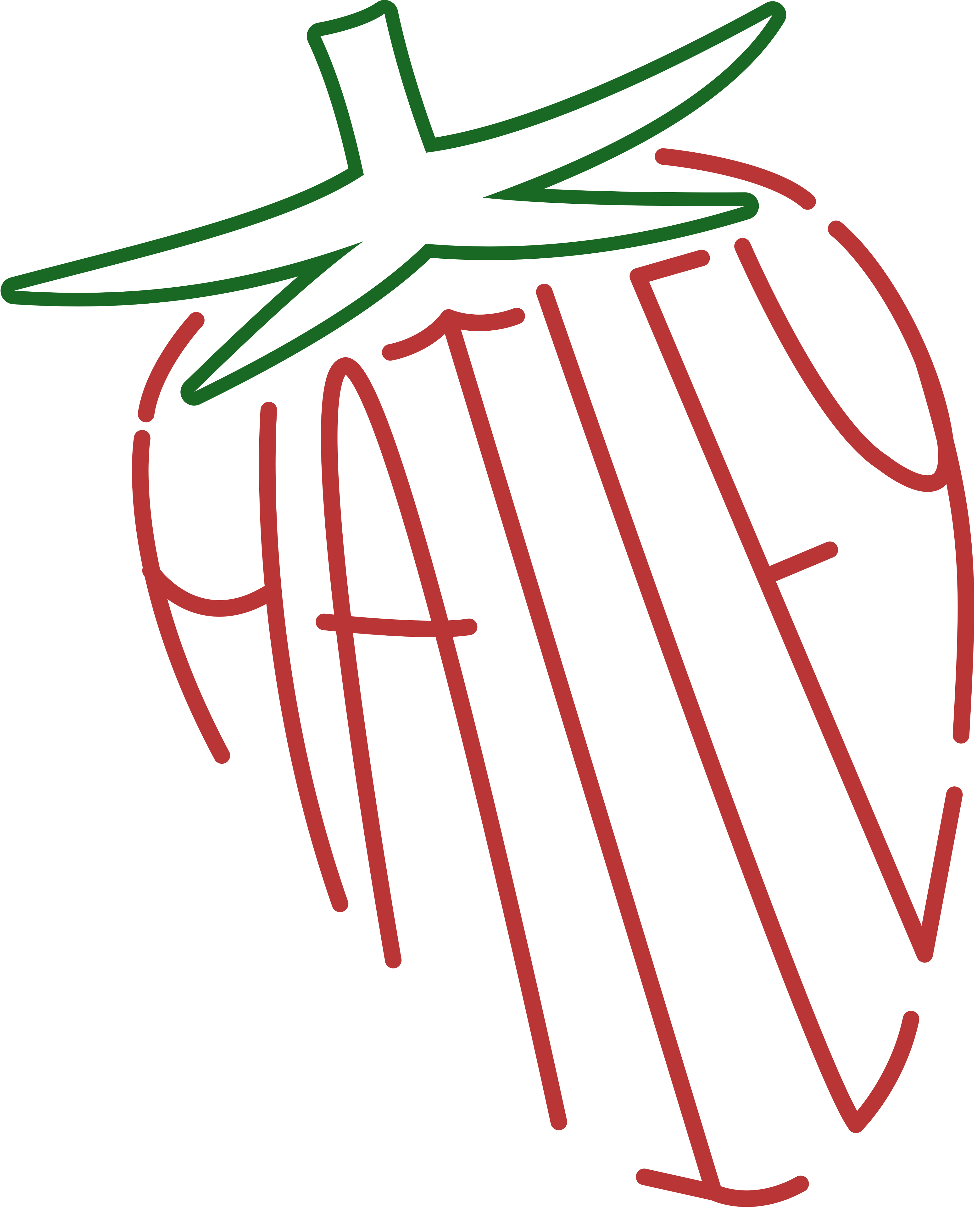
I was tasked with the assignment of hand rendering my own Type Design. I wanted to venture outside of my comfort zones of soft, rounded lines and pastels by going for a more geometric and deeper contrasted subject. I created a display typeface inspired by the aesthetics of Y2K with a hint of Sci-Fi and the Fast and Furious.
This is the primary photo for my Typeface Ad as it displays the typeface itself as well as its introduction.
The second ad showcases the typeface with a reflective tagline of the topic and visual aesthetic. Both ads were completed in Adobe Photoshop to best display how the typeface can be used and how it should be perceived visually.
Below are the refined and vectorized letterforms I had created and pulled into Adobe Illustrator.
This project layout was to reflect that of the of a Typeface card you would see scrolling through Behance for example. The second card, as seen above, was the phrase used alongside the title card to show usage of my other letters. I thoroughly enjoy typography and was happy to create my own letters by hand.
